Dplyr & Sparklyr usage
In this example, I want to show the possibility to perform with the same syntax local computing as well as distributed computing thanks to the Sparklyr package.
To do that I will use the nycflights13 dataset (one of the dataset used in the Sparklyr demo) in order to check if the number of flights by day evolves according to the period of the year (the month).
Spoiler: It varies but not so much.
Using tidyverse tools
To perform computing on your laptop in R, the best way to go is to use the tidyverse packages.
library(tidyverse)
# Airline on-time data for all flights departing NYC in 2013.
flights_tbl <- nycflights13::flights

# Simply dividing the number of flights by the number of days in the month
flights_tbl %>%
  group_by(month) %>%
  summarise(nb_flight_day = n() / n_distinct(day))  %>%
  ggplot(., aes(x=month, y=nb_flight_day)) +
  geom_col()

Using sparklyr
The beauty of the sparklyr package is that you can reuse (almost) the same code to scale and run the computations on millions of lines (for example for all the flights in several years) in a Spark cluster.
I’m saying almost since you will notice that the only difference is a call to collect. This call permits to retrieve the computed data to the driver (running in this case on your machine) to be able to plot it. It’s not a problem even with a dataset containing millions of rows since the result will always contain only 12 rows (one for each month).
This is a great benefit for data scientists who do not have to learn a new language / framework. This is not the case in Python. If you use python pandas on your laptop, you will have to rewrite completely your code in PySpark to be able to benefit from distributed computing in Spark.
In the first example I’m running spark locally (master = "local").
library(sparklyr)
spark_v <- "2.3.1"
sc <- spark_connect(spark_home = spark_install_find(version=spark_v)$sparkVersionDir,
                    master = "local")
# Converting the Tibble to a Spark DataFrame
flights_df <- copy_to(sc, flights_tbl, overwrite = TRUE, "flights")

# Running the same code :-)
flights_df %>%
  group_by(month) %>%
  summarise(nb_flight_day = n() / n_distinct(day)) %>%
  collect %>%
  ggplot(., aes(x=month, y=nb_flight_day)) +
  geom_col()

Spark standalone cluster
Now, I’m doing the same thing in a Spark Standalone cluster to be able to see the steps that are run to perform the computation. I’m using here the same Standalone Spark Cluster described in my previous article.
spark_v <- "2.3.1"
conf <- spark_config()

# I've 1G max in the cluster so spliting it in 2
conf$spark.executor.memory <- "512M"
# 1 core / executor to cores max for the application (I've 2 cores in the cluster)
conf$spark.executor.cores <- 1
conf$spark.cores.max <- 2
# 2 executors just for fun
conf$spark.executor.instances <- 2

sc <- spark_connect(spark_home = spark_install_find(version=spark_v)$sparkVersionDir,
                    master = "spark://localhost:7077",
                    config = conf)

# I'm reading the dataset from a parquet file accessible in the cluster
parquet_path <- "file:///tmp/data/flights.parquet"

# This is how to write the parquet file
# flights_df <- copy_to(sc, flights_tbl, overwrite = TRUE, "flights")
# spark_write_parquet(flights_df, parquet_path)

flights_df <- spark_read_parquet(sc, "flights", path = parquet_path)

# One more time the same code
flights_df %>%
  group_by(month) %>%
  summarise(nb_flight_day = n() / n_distinct(day)) %>%
  collect %>%
  ggplot(., aes(x=month, y=nb_flight_day)) +
  geom_col()
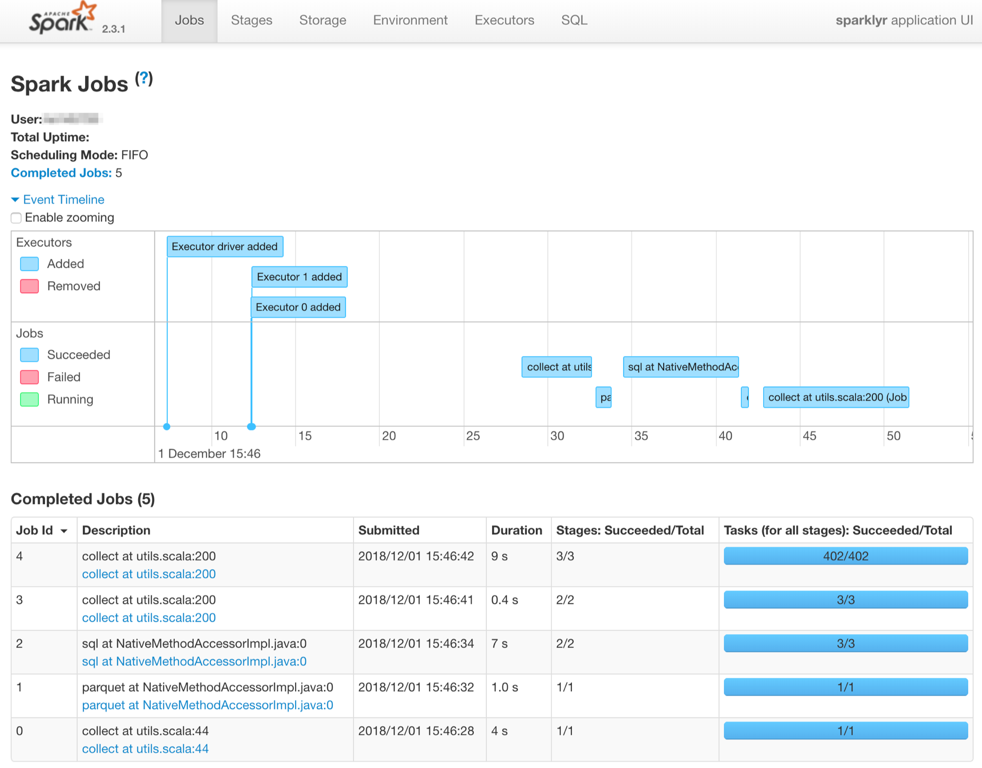
We can see in the history server UI (cf. Spark History Server available in docker-spark to know how to make it work) all the steps done to perform the computations. We can notice that the 2 workers are fired-up.
